
- UX is an ALL OR NOTHING strategy;
- User research is vital because you’re not real people;
- There is no “Standard UX” process;
- UX is not UI;
- UX deosn’t have to be original to succeed;
- Too many choices is not good UX;
- Attention to details provide good UX;
- Accessibility is a fundamental of UX;
- Usability Testing is crucial for UX;
- You may need a UX team;
- Conversion Rate Optimization is not Usability Testing
Author: Moris Urari
-
11 things you need to know
-
UX Reality Check
Here are 14 things you should know about the people who use your websites and applications.
1. They’re Smarter Than You Think
They just don’t care about learning your system, they are not in the tech industry like you.2. They Have Other Things To Do
The goal of most users is to get off a website, not staying in!3. They Have a “Doing Mode”
They are in mission to complete a task.4. They “Satisfice”
(Satisfy + Sacrifice)5. They Don’t Use Your Software The Way You Intended
Think about twitter: the @ and the # symbol.6. They Rely On Patterns
Patterns help people…7. A Million Things Are Competing For Their Attention
Choose ONE STEP AT A TIME process in a task flow.8. They See What’s There
Users see what’s actually there. Not what you think is there.9. They Lie
People seem to know themselves pretty well when being asked hypothetical questions… Kahnemann!10. They Don’t Know What’s Possible
Read between the lines. See what’s really causing their issue.11. If You Improve Their Lives, They’ll Love You
Most people want to be shown how the new way is better. If you solve a real problem, and you can demonstrate how to do it, your users will love you.12. They Come With Questions
You just have to consider what question they might ask.13. They Blame Themselves for Mistakes When It’s Your Fault
Listen to complaints.14. Their User “Experience” Is Based On Far More Than Your Website
Fonte: www.fastcodesign.com
-

iGelato Website
Website design for iGelato app by GlueStudio.
Software:
Adobe Photoshop©, Balsamiq Mockups© -
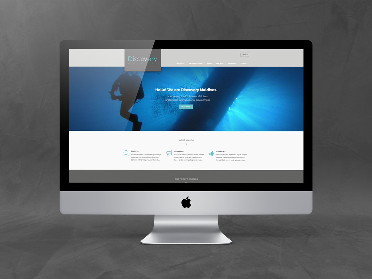
Discovery Maldives
Discovery Maldives is a web portal dedicated to the wonders of Maldives. The website was designed to provide a search tool for divers who want to discover the most interesting dive sites on the area. The information was compiled by experienced divers and marine biologists.
Besides being a guide for the most interesting places in the area, it was used to sensitize tourists on environmental issues of Maldivian fauna and flora.
The main actions was:
– Definition of product goals and time schedule;
– Benchmark competitors and similar tools;
– Collection of data from stakeholder;
– Definition of personas and scenarios;
– Content Strategy
– Sitemap and Navigation paths development;
– Wireframes creation;
– Mockups design.The result was a flexible, dynamic website with a powerful “search dive” tool.
Software:
Adobe Photoshop©, Adobe Illustrator©, Axure©, Balsamiq Mockups©See it on Behance: Here
-
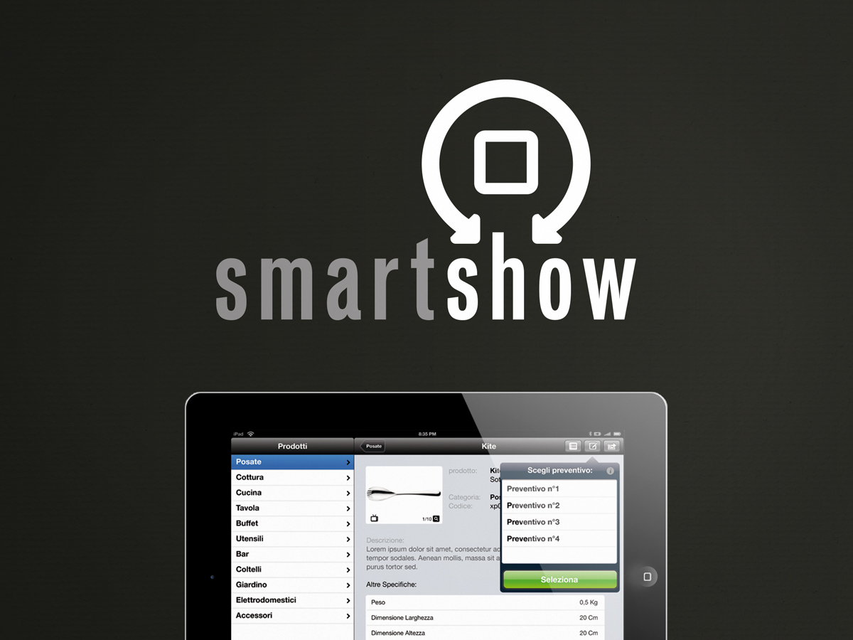
SmartShow iPad App
SmartShow iPad App.
Software:
Adobe Photoshop©, Adobe Illustrator©, Balsamiq Mockups© -
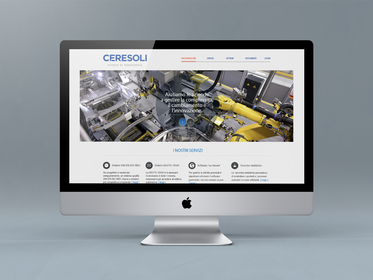
Studio Ceresoli Website
Website design for engineering studio Ceresoli. An organized new website to show services and company portfolio.
Software:
Adobe Photoshop©, Adobe Illustrator©, Balsamiq Mockups© -

SmartDrive Website and iPad App
SmartDrive Website and iPad App.
Software:
Adobe Photoshop©, Adobe Illustrator©, Balsamiq Mockups© -
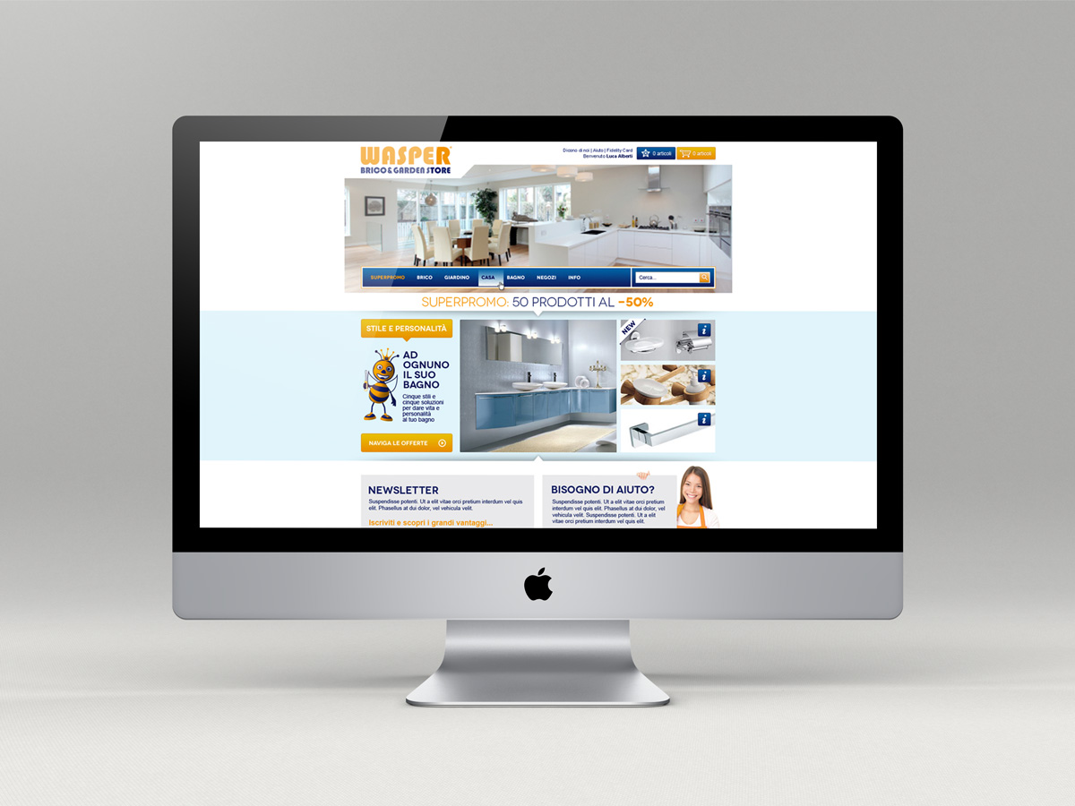
Wasper Ecommerce
Wasper is a traditional hardware store, with three branches in Lombardy, who wants to bring the quality of its products and the convenience of its prices in the rest of the country with an online store. The client has been successful with other ventures, but this is his first time building an ecommerce: I will offer guidance on the web-based marketing strategy.
The main steps was:
- Explainin to the client, and partners involved, the design process;
- Taking the client through the research phase to define the expected users, features, and product goals using personas;
- Creating a map of the entire website to show how the pages are accessed and connected;
- Creating wireframes to show content, product details, and purchase process;
- Define design features with mock-ups;
- Development;
- Delivery.
The research phase was composed by: stakeholder interviews, competitive analysis, personas, weighing and prioritizing features.
The information architecture phase was composed by: task flow definition, diagrams, site mapping and wireframing.
The visual design phase was composed by: color scheme definition, pattern definition and mock-ups.Software:
Adobe Photoshop©, Adobe Illustrator©, Axure©, Balsamiq Mockups© -
The 10 Usability Heuristics
From Jacob Nielsen
Visibility of the system status
The system should always keep the user informed about what is going on, through appropriate feedback within reasonable time.Match between the system and the real world
The system should speak the users’ language, with words, phrases and concepts familiar to the user. Follow conventions from the real world, making information appear in a natural and logical order.User control (and freedom)
Users often choose system functions by mistake and will need a clearly marked “emergency exit” to leave the unwanted state without having to go through an extended dialogue. Support undo and redo.Consistency and standards
Users should not have to wonder whether different words, situations, or actions mean the same thing. Follow platform conventions.Error prevention
Even better than good error messages is a careful design which prevents a problem from occurring in the first place. Either eliminate error-prone conditions or check for them and present users with a confirmation option before they commit to the action.Recognition rather than recall
Minimize the user’s memory load by making objects, actions, and options visible. The user should not have to remember information from one part of the dialogue to another. Instructions for use of the system should be visible or easily retrievable whenever appropriate.
(Read full article on recognition vs. recall in UX.)Flexibility and efficiency of use
Accelerators — unseen by the novice user — may often speed up the interaction for the expert user such that the system can cater to both inexperienced and experienced users. Allow users to tailor frequent actions.Aesthetic and minimalist design
Dialogues should not contain information which is irrelevant or rarely needed. Every extra unit of information in a dialogue competes with the relevant units of information and diminishes their relative visibility.Help users recognize, diagnose, and recover from errors
Error messages should be expressed in plain language (no codes), precisely indicate the problem, and constructively suggest a solution.Help and documentation
Even though it is better if the system can be used without documentation, it may be necessary to provide help and documentation. Any such information should be easy to search, focused on the user’s task, list concrete steps to be carried out, and not be too large.Here is the original article by Nielsen: http://nngroup.com/articles/ten-usability-heuristics